Case

This case contains confidential data that has been intentionally omitted to respect privacy and confidentiality agreements. If the brand identifies any additional information it would like to have removed or wishes to discuss further confidentiality measures, please feel free to reach out directly.
Challenge
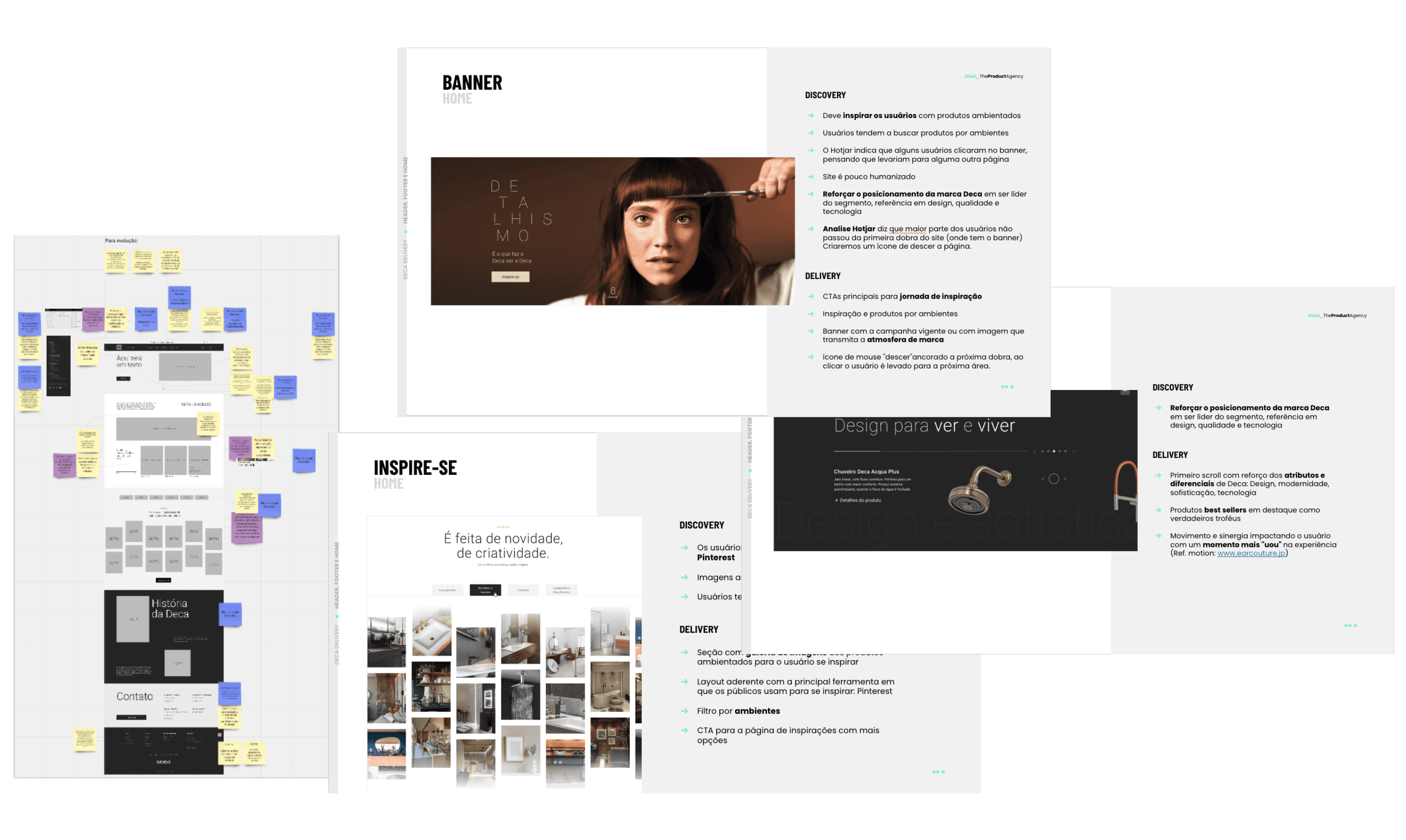
Discovery for Deca, a leading company in the metal and sanitary ware segment for construction, focused on its website. The goal was to identify opportunities for better product presentation, update brand positioning, and deliver an exceptional experience for diverse audiences.
Findings
Primary user: Architects
Casa Cor is the main source for staying updated on trends and inspiration in the architecture market.
Pinterest is the most-used digital platform during the creative process.
Project stages in order: 1. Plumbing, 2. Structure, 3. Finishes and Coatings.
Design elements defined in order: 1. Room size, 2. Style, 3. Color.
Frequently visits brand showrooms.
Signature collections are often requested by Class A clients.
Sustainability is sought in a technical sense but is not a decisive factor (e.g., timers, flow regulators, duo systems).
The search begins with room planning. Rooms with the highest investment in order: Kitchen, Bathroom, and Laundry Room.
Measurements are crucial (size, height, width).
Searches focus on cost (low to high prices) and benefits (durability, quality, warranty), with greater emphasis on benefits over cost.
Reviews technical specifications, with Deca already being a reference in this area.
Searches for colors (White, Matte Ebony, Matte Brown).
Searches for shapes (Round, Square, Oval, Rectangle).
Uses desktop throughout the process, occasionally switching to a tablet.
Conducts product anatomy studies.


Decisions
Prioritize the inspiration journey: Inspire users with products in context and ensure the layout aligns with their main inspiration tool, Pinterest.
Highlight signature collections and exclusive products.
Structure navigation around room-specific searches.
Reinforce Deca's position as a leader in the segment, recognized for design, quality, and technology.
Home page:
First scroll: Highlight Deca’s attributes and differentiators—design, modernity, sophistication, and technology.
Best-selling products featured as "trophies."
Second scroll: Showcase launches in contextualized settings, with links to the product or collection.
Product architecture: reorganize by room and create custom filters for each category, considering product anatomy studies.
Product page: provide a complete technical data sheet with fields like flow rate, pressure, activation mechanism, technical drawings, technologies, etc.
Navigation layers: Restructure to address the funnel objectives—navigational, informational, and finally transactional.
Create relative search terms (e.g., Deca uses “Bowl,” but users search for “Toilet,” “Loo,” or “Sanitary Ware”).
Results
42%
Redesigned information architecture for the product tree
New design system aligned with Deca's rebranded